


Designing the Multiverse: When Google Wore a Dust Jacket
What if the world’s most powerful search engine launched as a 1950s encyclopedia set? A speculative design experiment where playful "what ifs" reveal surprisingly real insights.

Welcome to Designing the Multiverse, where I imagine what iconic brands might look like in entirely different timelines — not just for fun (though, yes, it's fun), but to see what creative lessons we can pull from the shift in context.
When you place a modern brand into an alternate era — say, Google in 1955 — you're doing more than playing dress-up. You’re asking:
What happens to meaning when you change the medium?
What assumptions does a brand carry that we only notice when the tech gets stripped away?
What does trust look like in another time?
How much of design is just cultural fluency disguised as strategy?
Each entry in this series is part thought experiment, part design riff, and part gentle invitation to see familiar things a little differently.
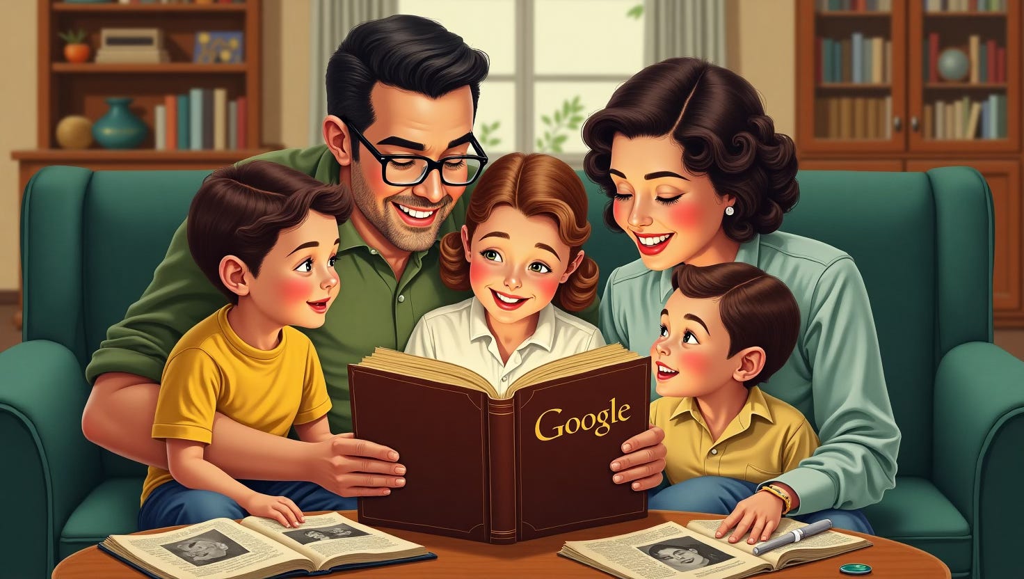
It’s 1953. The internet doesn’t exist, but your living room features a solid wood bookshelf and a proud new purchase: The Google Encyclopedia — a handsome 14-volume set of leather-bound knowledge, updated once a decade.
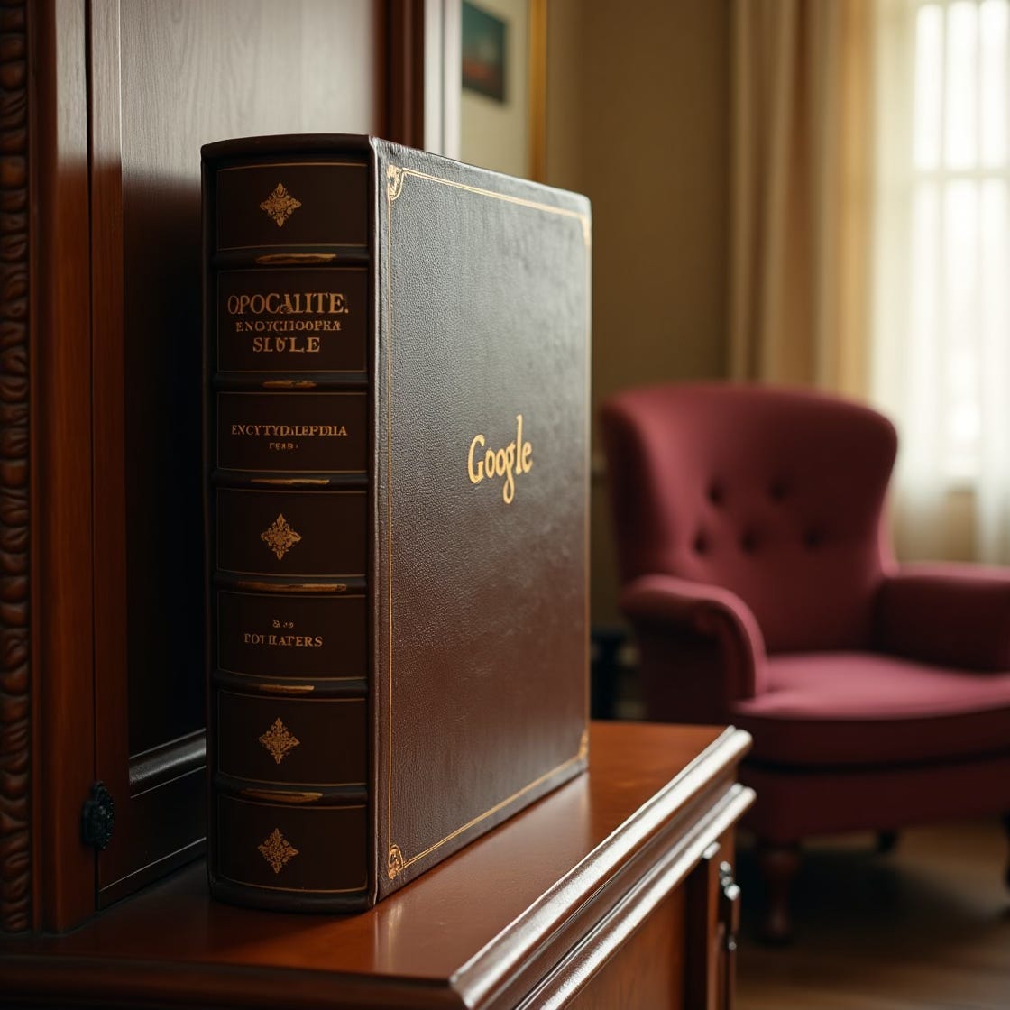
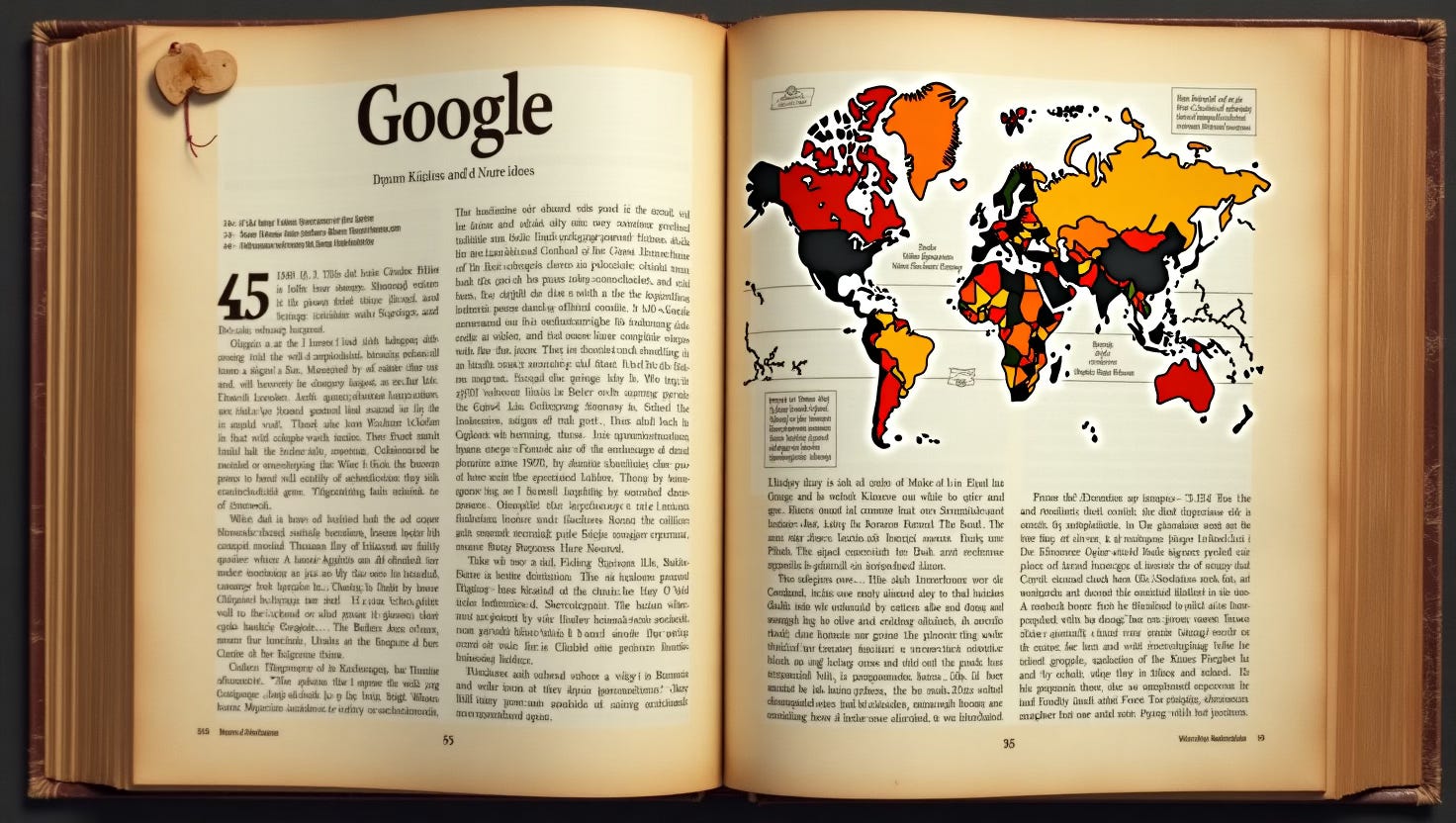
The Google logo is rendered in gilt serif type. The spine features coloured indexing tabs. Inside, articles are laid out in two columns, punctuated by helpful illustrations, cross-referenced footnotes, and perhaps a note to "see also: Bing."
Search? You don’t search. You browse. You flip. You learn things you didn’t even know you needed.
You feel smarter already.
Why This Actually Matters
Beyond the fun, there’s something valuable here:
By pulling Google out of the digital world and into the physical one, we’re reminded that the format of a brand — the container it lives in — changes how we feel about it.
In 2025, Google is fast, frictionless, and… a little spooky.
In 1955, it’s permanent, tactile, and earned its place on the shelf.
The encyclopedia metaphor is also a reminder that trust used to be heavy. Literal weight meant something. There was time involved. Materials. Presence.
Now, trust is featherlight — and often algorithmic. And that shift shows up in how we design.
This isn't just about retro vibes — it's about recognizing how assumptions bake themselves into our work. When you change the world, you change the rules of design. That’s the kind of thinking that leads to smarter choices, not just trendier ones.
The Takeaway
What would your brand look like in another timeline?
If it had to live on paper? In a theatre? On the side of a cassette?
What would survive the shift — and what would change?
I love thinking about design from unexpected angles — especially when those angles help us see the present more clearly. If this kind of perspective-shifting hits home for you — or you'd like to bring it to your team, classroom, or event — let’s talk.