Designing the Revolution: How Zohran Mamdani’s Mayoral Campaign Turned Political Branding on Its Head
What happens when the left borrows the playbook of populism — and hands it to a designer?
Design doesn’t just make things look good — it makes people feel seen. And when it comes to political movements, nothing is more powerful than a message that feels like it was made just for you.
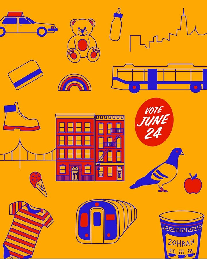
When New York Assemblymember Zohran Mamdani announced his run for mayor of New York City, it wasn’t just his politics that broke the mold — it was his design. Gone were the tired patriotic clichés, the stock photography of half-smiling families, the hollow serif logotypes begging for centrist approval. Instead, Mamdani’s campaign burst onto the scene with a vibrant, defiant, almost zine-like aesthetic: handmade typography, electric colors, visual repetition, and raw, urgent energy.
For anyone used to the templated, consultant-driven look of mainstream political campaigns — especially in the U.S. — it was a jolt. And that was the point.
Let’s rewind for a second. For those not deep in American politics: Zohran Mamdani is a Democratic Socialist and sitting Assemblymember in New York, part of a rising tide of progressive Dems who have repeatedly challenged the old guard of the Democratic Party. Think AOC, Cori Bush, Jamaal Bowman — names that don’t just advocate for policy, but for structural change. In announcing his candidacy for mayor, Mamdani entered the race not just as a politician, but as a signal flare for a new kind of politics: one that didn’t just say “for the people,” but looked like it too.
And here’s the kicker: he (and his design team) understood that aesthetics are political.
A Visual Manifesto
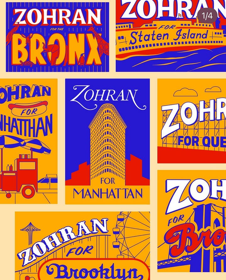
At a glance, Mamdani’s campaign design looks almost amateur. That’s not a dig — it’s a deliberate, powerful design strategy. There’s an intentional lo-fi, DIY energy that recalls punk posters, neighborhood flyers, wheatpaste culture. It’s urban. It’s scrappy. It’s grassroots — because so is the movement. This wasn’t Helvetica and a flag motif; this was Sharpie scrawl energy translated through a grid.


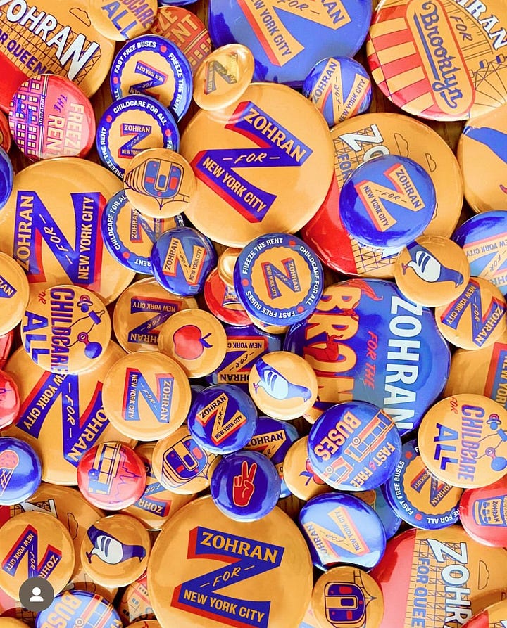
The color palette? Not the usual flag-draped fare. Instead: a punchy, stripped-down set of hues that feel more street mural than Senate floor. The handmade lettering (and I mean literally hand-drawn letterforms) sends a loud message: this wasn’t churned out of a branding agency. It was made by people, for people. Every poster feels like it could have been pulled off a Brooklyn lamp post or an underground show flyer.
“We weren’t trying to be edgy or cool,” says Sophie Abramowitz, one of the designers. “We were trying to reach people in our city and our neighborhoods — to create something familiar and local.”
That authenticity is palpable. And it’s not accidental.
Because when you’re trying to speak to people who feel ignored by the system, there’s nothing more alienating than looking like the system.
Populism, Reclaimed
What fascinates me — especially from my vantage point north of the border — is how Mamdani’s campaign leverages populist design tactics that we usually associate with the political right. High contrast messaging. Fearless simplicity. A sense of “us vs them.” This is the populist formula that right-wing candidates have ridden to power in country after country — and Mamdani flips it.
Instead of dog whistles and nationalism, his campaign shouts about rent control, worker power, and Palestinian solidarity. The tools of populism — clarity, emotion, repetition — are all there. But the content is solidarity, not supremacy.
Here in Canada, we’re watching a parallel reality. The right has seized the language of affordability and frustration — and used it to stoke division. But there’s no reason progressives can’t also tap into that same visceral sense of urgency. What Mamdani’s campaign proves is that you can build a populist movement from the left without sacrificing truth or design integrity. In fact, bold design amplifies the message.
Scale, Format, and Relentless Message Discipline
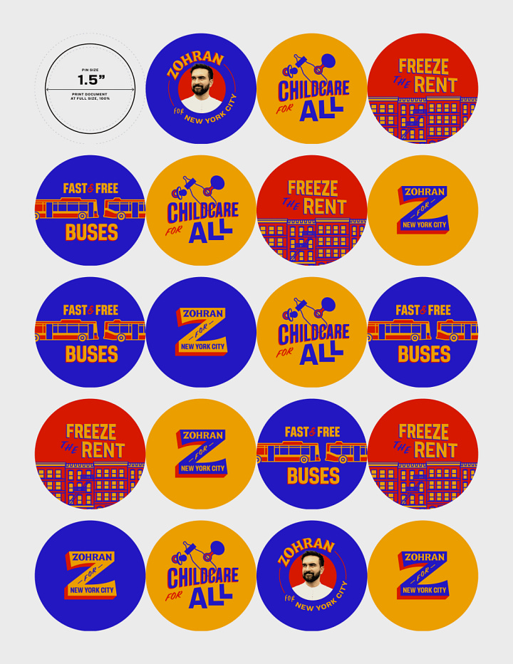
Another masterstroke: the sheer format diversity of the campaign assets. Posters, stickers, T-shirts, bus shelter takeovers, subway ads, memes, even branded clothing that looked more grassroots art collective than mayoral swag. It’s a lesson in brand architecture. They understood how people encounter campaigns — not just on social, but walking through the city. The branding met people where they already were.


But more than that, it’s about message discipline. In every format, the visual and verbal messaging never strays. The economy is killing us. Landlords have too much power. You deserve better. Over and over. That’s not a lack of nuance — that’s strategy. Because clarity cuts through.
The best political branding doesn’t ask to be admired. It demands to be noticed. And believed. And remembered.
So what can we take from this?
At Orbit Studios, we believe that design isn’t just about looking polished — it’s about revealing your truth. Whether you’re launching a movement, a brand, or a campaign, clarity and conviction are your best assets.
“It wasn’t about branding a candidate — it was about building a language people already knew how to speak.”
That’s not just smart strategy. That’s good design.
If your brand needs that same kind of strategic courage — the kind that resonates, not just reads — let’s talk.


Beautifully articulated, Dave! I hadn't seen him or his campaign before he got elected, so I wondered, "Where the hell did this guy come from?" Now it all makes sense. So beautifully strategic, and it shows that he put power and agency in the hands of designers who spoke the language of New Yorkers.