

DesignNova: The Roundel That Organized a City
How London Underground proved that branding isn’t decoration. It’s infrastructure.

DesignNova takes a behind-the-scenes look at some of the world’s most iconic brands, uncovering the stories, strategy, and systems that made them enduring. Some logos identify. Others guide. A rare few shape the way an entire city moves.
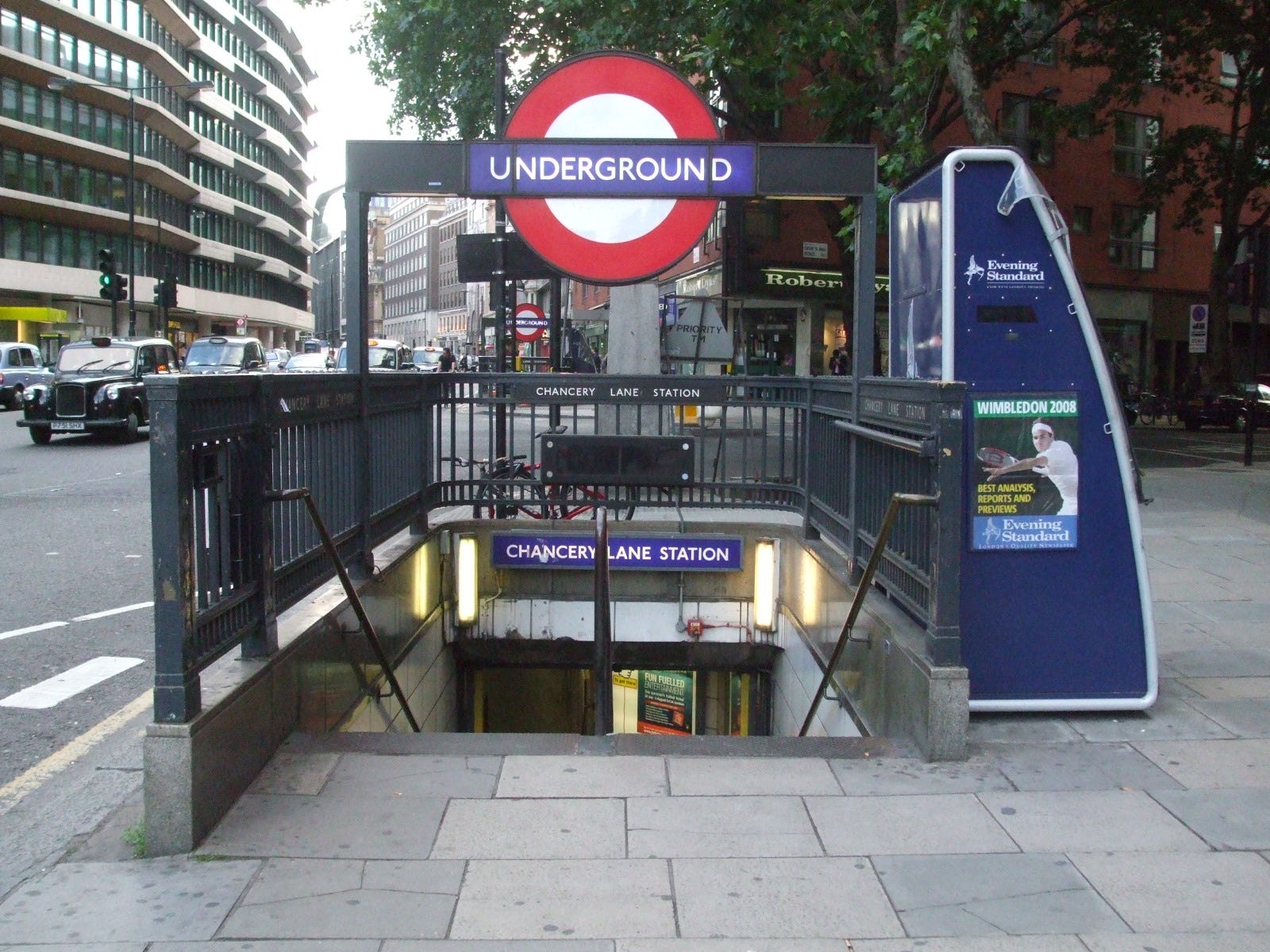
When people think of the London Underground, they picture the red circle and blue bar.
The Roundel.
Simple. Bold. Impossible to confuse.
But what makes it remarkable isn’t the mark itself. It’s what grew around it.
A Solution to Chaos
At the start of the 20th century, London’s transport system was fragmented. Multiple private rail companies operated different lines, each with inconsistent signage, naming conventions, and visual language. Stations were crowded with advertisements. Navigation required patience.
The Roundel began as a practical intervention.


In 1908, a red disc with a blue horizontal bar was introduced to make station nameplates visible from a distance and legible in busy environments. The bar framed the station name cleanly. The circle created contrast. Nothing about it was ornamental. Every element served clarity.
It worked.
More importantly, it was repeatable. A small graphic device began creating visual continuity across a sprawling network.
The Typeface that made it Timeless
In 1916, calligrapher and typographer Edward Johnston was commissioned to develop a bespoke typeface for the Underground.
The brief was not aesthetic experimentation. It was coherence.
Johnston created a typeface that was geometric yet distinctly human. The forms were clean, open, and balanced. They rejected Victorian ornamentation and leaned toward modernist restraint. The result was legible at scale, readable underground, and distinctive without being decorative.
It became one of the earliest examples of a custom corporate typeface applied systematically across an entire organization.
Consider the timing.
In 1916, most companies had not yet articulated the idea of brand identity as we understand it today. The Underground was already standardizing typography, signage, and visual hierarchy across a complex public system.
This was not branding as embellishment. It was branding as organization.
The Map that Rewired Perception
In 1933, Harry Beck introduced a radical redesign of the Tube map.
Geography was no longer the priority. Clarity was.
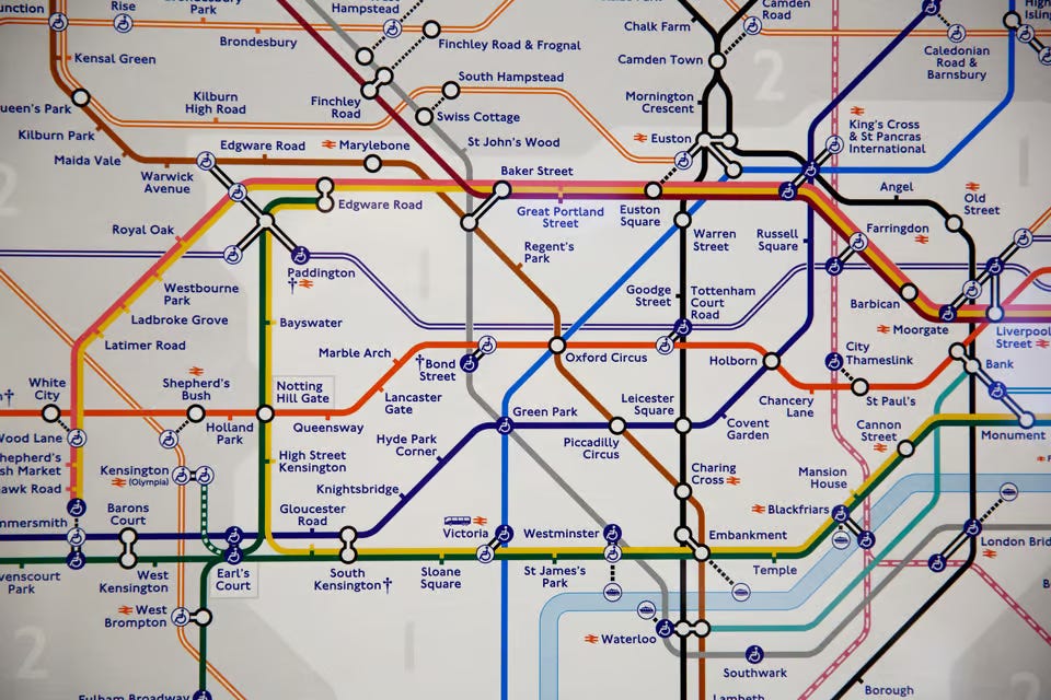
Beck simplified the network into a diagram inspired by electrical circuit schematics. Lines ran horizontally, vertically, or at 45-degree angles. Stations were evenly spaced. Distances were abstracted.
The result was easier to read and easier to remember. It reframed how Londoners understood their city. Neighborhoods felt closer. Routes felt logical.
The map did more than communicate direction. It reshaped perception.
Around it, the system continued to mature. Posters followed modernist principles. Station architecture embraced clarity and restraint. The Roundel remained the anchor point across platforms, entrances, and printed materials.


This was not a logo applied to assets. It was a coordinated visual language embedded into daily life.
A Masterclass in Brand Governance
More than a century later, the identity remains intact:
The Roundel
Johnston typography, refined but recognizable
Consistent colour coding across lines
Strict application standards
The system has evolved, but the foundation has not shifted.
It works because it was conceived as a system from the beginning. Not a logo first. Not a campaign first. A structure for clarity.
Systems scale. Decoration does not.
The Strategic Takeaway
The most enduring brands do more than communicate.
They coordinate.
The London Underground identity did not succeed because it was expressive or fashionable. It succeeded because it reduced friction, unified experience, and made complexity navigable at scale.
Strong branding organizes reality. At its best, it becomes invisible infrastructure.
That is a higher bar than aesthetics.
At Orbit, BrandSprint is built on the same principle: clarity before aesthetics, systems before surface. The strongest brands don’t just look good. They work across touchpoints, teams, and time.
If you’re rethinking how your brand operates, not just how it appears, let’s continue the conversation.