

Hand‑Drawn = High‑Tech: Why Imperfection Is the Ultimate Design Signal
In a world of AI‑polished perfection, human-made marks are the new flex. A look at why sketchy, scribbly, hand-drawn design isn’t just charming — it’s strategic.

This entry is part of an ongoing series where I explore the strange-but-true shifts in modern design culture. Sometimes we build thought experiments (like Designing the Multiverse), and sometimes we zoom in on emerging aesthetics and ask: what’s really going on here?
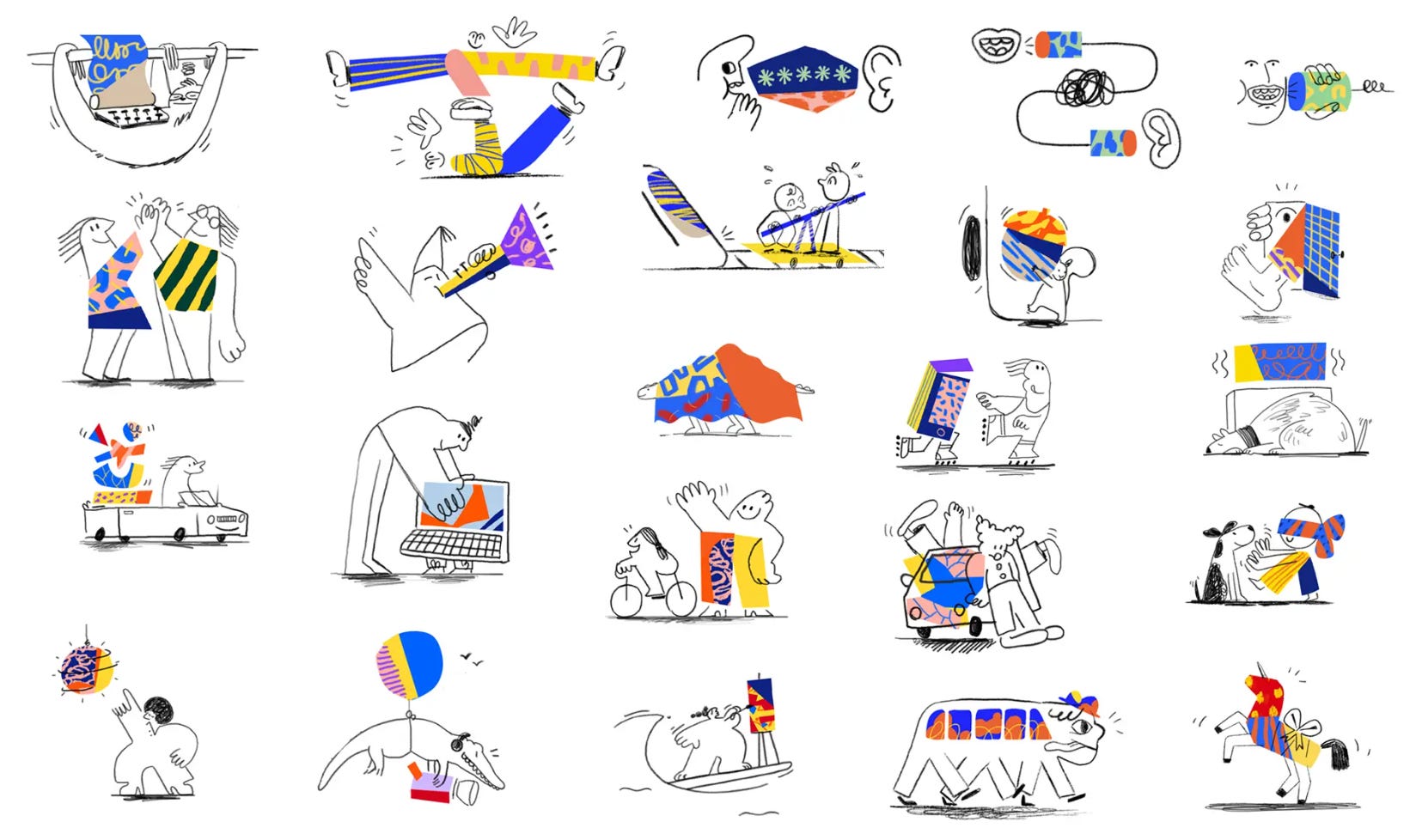
This column looks at the rise of hand-drawn elements in digital design — not as quirky decoration, but as a design strategy. When you see a sketched icon, a scanned Post-it, or a comic-panel UI, it’s not laziness. It’s intent.
The Core Idea
In the age of infinite polish, imperfection is now a signal of care.
Hand-drawn design isn’t just retro or artsy — it’s a deliberate choice that tells your audience:
“This was made by a person, for a person.”
Whether it’s a scrawled annotation, a pencil-drawn logo, or a UX wireframe with wobbly lines, that handmade feel disrupts the smoothness of the feed. And in doing so, it creates emotional texture.
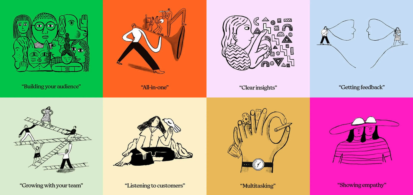
Why It Works (with Examples)
This aesthetic is showing up in smart, strategic ways:
Slack's hand-drawn onboarding doodles → signal playfulness and accessibility
Mailchimp’s irregular illustrations → say: “We’re creative, not corporate”
Dropbox’s sketchy identity system → makes cloud storage feel surprisingly personal
Zine-style websites, Post-it planning shots, rough sketches in pitch decks → now used to build trust, not just show process
And the common thread? Intentional imperfection.


Why This Matters Right Now
We’re in a moment where everything digital is either overly optimized or machine-generated. And in that space, the hand-made cuts through.
It disrupts sameness in the scroll
It creates memory in a hyper-smooth ecosystem
It builds emotional trust — not through polish, but through personality
These kinds of marks say:
"This wasn't churned out. It was considered."
And that is starting to read as high-tech.


The Takeaway
Try it in your next project:
A sketched wireframe
A comic-style explainer panel
A photo of a sticky note on your whiteboard
Sometimes the smallest human mark changes how your audience feels — and that’s what makes it good design.
I love exploring how design choices speak louder than they look — especially when those choices bring back the human touch. If this kind of thinking clicks with you — or you’d like to bring it to your team, event, or class — let’s talk.
I love the suggestion to “ get sketchy”! I’m an artist- I can sketch! But seriously - I can totally see a message in black sharpie on a yellow post it note breaking up the scroll in FB stories and other feeds. Great idea!