


Rapid Reaction: Apple’s Liquid Glass — 80% Vibes, 20% UX
A shiny new UI that looks amazing in trailers, but forgets the fundamentals of usable design.

Design innovation is supposed to move us forward. But sometimes it just circles the runway in a shinier jet.
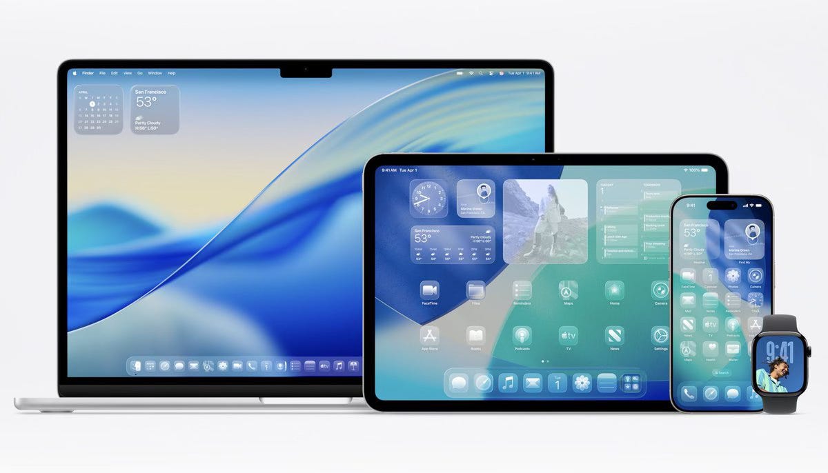
This week, Apple unveiled its shiny new "Liquid Glass" interface — a translucent, frosted design language that will soon coat iOS and macOS in soft gradients and floaty visuals. The fanfare was predictably breathless. The interface is “delightful,” they say. “Elegant.” Words like joy, depth, and materiality got a real workout in the press release.
But let’s take a step back. Or better yet, let’s squint hard enough to actually read something on this UI.
Because under the surface — pun intended — Liquid Glass looks less like the future and more like the past dressed up in a GPU-intensive evening gown.
Look Familiar?
Let’s be clear: visually, this is impressive work. The micro-interactions and component-level animations are sleek. Buttons feel like they belong in space. The glass effect is executed with the kind of fidelity only Apple can pull off.
But as several designers have pointed out, that polish falls apart at the system level. Once you stack components, layer background blur, and push the interface into real-world scenarios, you quickly run into issues: readability tanks, contrast drops, and accessibility gets thrown under a bus driven by Jony Ive’s ghost.
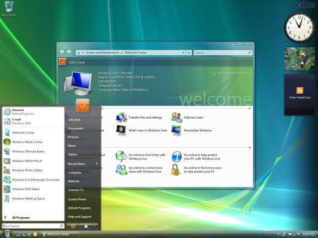
And let’s be honest — haven’t we seen this before? Windows Vista from Microsoft tried the translucent-glass thing almost two decades ago. It looked futuristic in screenshots, but in actual use? Sluggish, impractical, and ultimately forgettable.
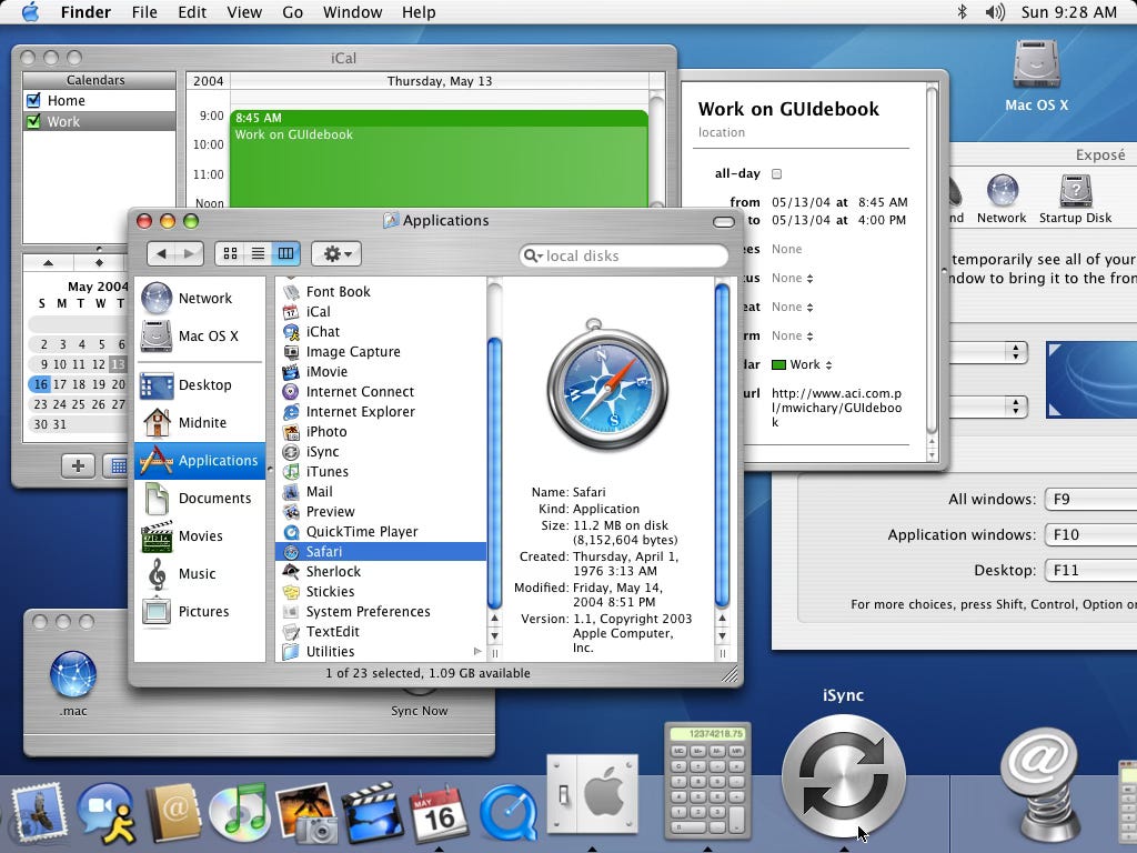
Apple already nailed the glass look once with Mac OS X’s original Aqua — it was bright, fun, and shockingly readable. This new version feels like a regression: all the gloss, none of the clarity.
The Accessibility Regression
Let’s talk usability. Or the lack of it.
“Liquid Glass” seems like a step backward for users with any kind of visual impairment. The blurred backgrounds and translucency effects are beautiful in motion but difficult to parse in daily use. If you have to dig into system settings to make your OS legible, that’s not thoughtful design — that’s a bug disguised as a feature.
There are already user-created workarounds circulating — not a great sign when the thing hasn’t even launched yet. Among the concerns:
Inconsistent contrast and legibility across apps
Poor visibility for low-light or low-vision users
System lag or power strain on older devices (because yes, rendering live glass isn’t cheap)
Remember: accessibility isn't optional flair. It's foundational. Or at least it should be.
Pretty ≠ Practical
Of course, Apple is positioning this shift as a design renaissance — a move beyond flat design, away from the minimalist palettes of the last decade. Fine. We’ve been due for a visual evolution.
But visual style without functional thinking is just motion graphics with a login screen.
Even back in the genie-effect days of early OS X, Apple’s aesthetic choices still worked. The Aqua interface wasn’t just fun — it was readable, usable, and ran smoothly on the hardware of the time. Liquid Glass? It feels like a concept trailer that accidentally escaped into the real world.
Which brings us to the question: Why now?
Is This the Precursor to “Post-Screen” Design?

Some speculate this is Apple easing us into a world of spatial computing — where your primary UI is in a headset or glasses (see here). If so, maybe this ethereal UI makes sense on floating glass panels in mixed reality.
But if you're rolling this out for phones, laptops, and tablets first? Then the effect needs to serve real-world usability — not just camera demos.
Until we’re all wearing Vision Pros on the subway, the OS still needs to work in sunlight. On aging screens. For people with different needs.
TL;DR: Design for Real People, Not Just Promo Videos
Apple’s Liquid Glass is a compelling design experiment — and a masterclass in aesthetics — but a frustrating experience in practice. It may wow in the keynote trailer, but everyday users don’t live inside a launch video.
And when the best reaction to your UI update is this tweet…
“liquid glass is the UI equivalent of putting vaseline on your windshield and saying it's more immersive.”
— @battleangelviv
…it might be time to revisit your user testing priorities.
At Orbit, we love beautiful design. But more than that, we believe good design should never get in your way. The best interfaces don’t ask you to admire them — they just work.