


Rapid Reaction: Boston Rewinds the Tape — And Gets It Right
Boston’s latest rebrand is a near-perfect remix of their ‘80s glory years — with just one sock-related sour note

Welcome to Rapid Reactions — a recurring series where I critique newly unveiled design work from a professional’s lens. Part aesthetic breakdown, part brand analysis, all expert-level design critique. Whether it's a sports uniform, a tech product, or a bold new brand identity, this series is where form, function, and first impressions collide.
The Boston Bruins just made their long-overdue return to form — and this time, they brought the right kind of baggage from the '80s with them. In an era where NHL rebrands often default to excessive bevels, gradients, and digital detritus, this one is refreshingly... correct.
There’s not a ton to overanalyze here — and that’s a compliment. This redesign doesn’t scream for attention; it just looks better, cleaner, and more like the Bruins again.
Branding: A Masterclass in Subtraction
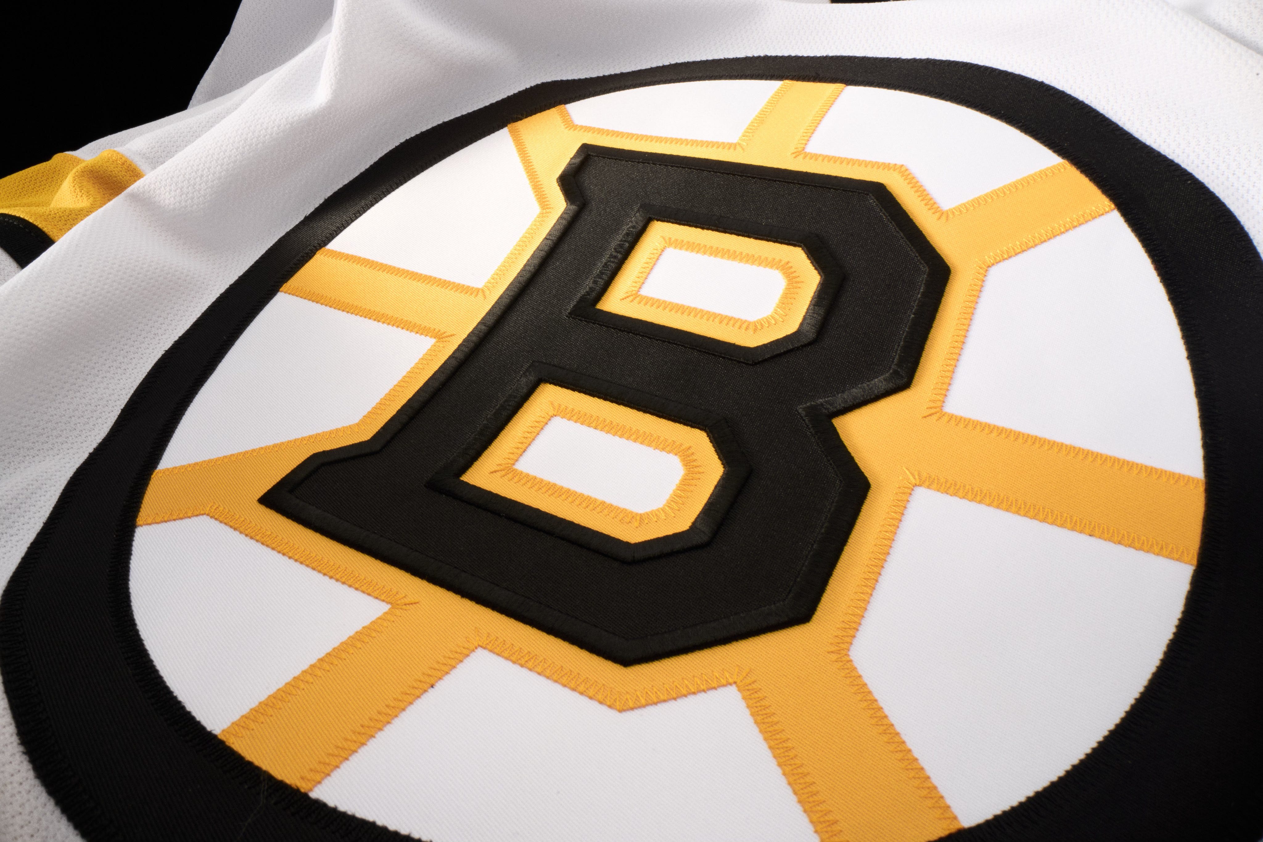
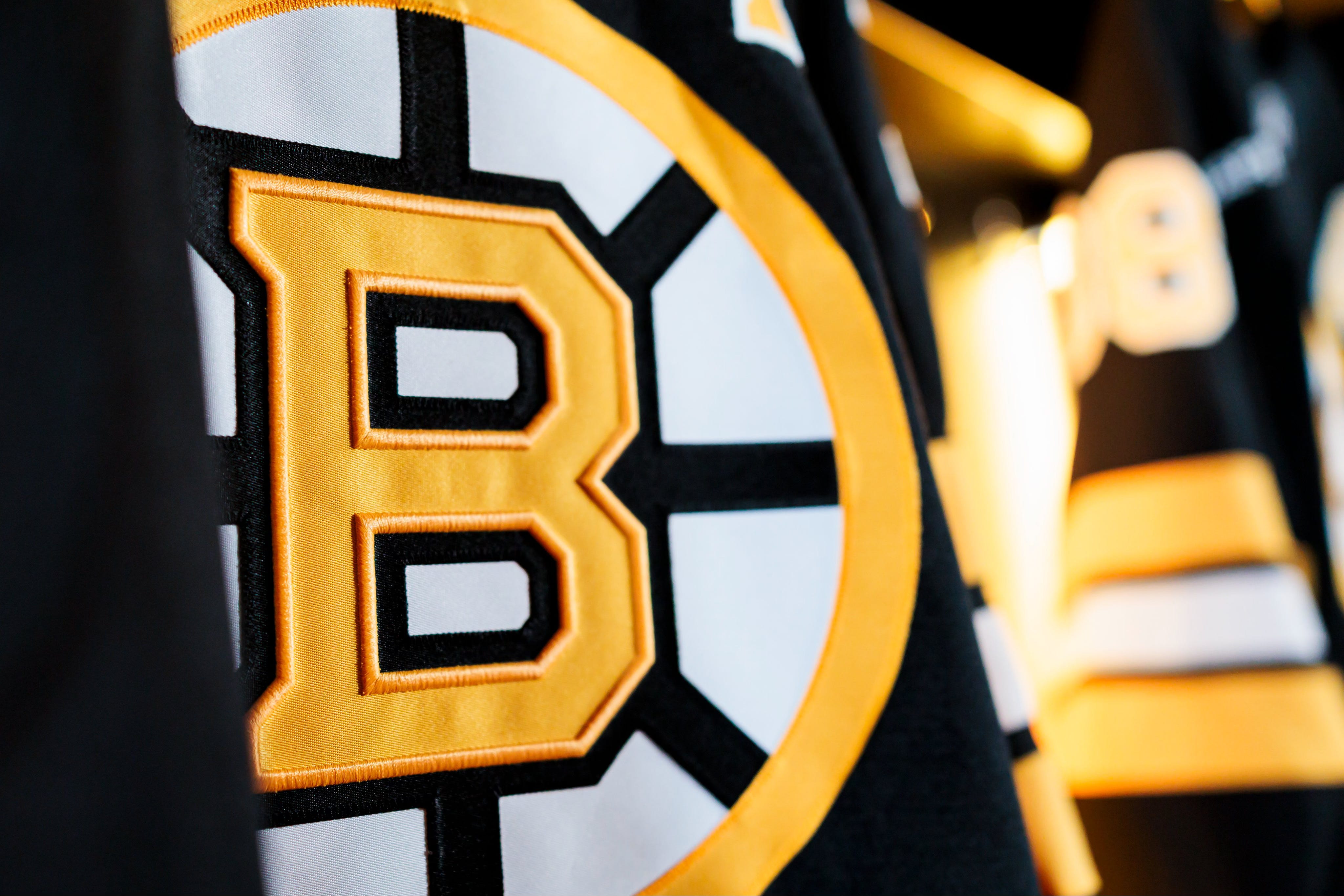
Let’s begin with the logos. Boston finally stripped away the unnecessary strokes and clutter that had been weighing down the iconic Spoked-B. What’s left is a tighter, cleaner identity that lets the geometry do the talking.
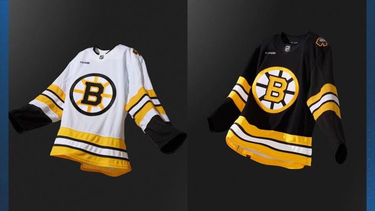
I love that they’ve returned to differentiated colour applications for home and away: the white jersey gets the black circle and traditional B, while the black jersey flips that with a gold ring and gold B. That kind of visual intelligence — creating optimized versions of the same mark for different backgrounds — is what corporations do all the time. It’s elegant, intentional, and just makes sense.
They kept the angled, blocky serifs on the B — which I could take or leave — but I’ll concede that the slanted tips echo the spoke angles nicely. I still have a soft spot for the pure sans-serif B from days past, but this one works, especially now that the excessive outlines are gone.
Uniforms: Less Is More (Again)
The uniforms themselves take their cues from the Ray Bourque-era classics, and the results are spot-on. Gone are the shoulder yokes, which means the jerseys now breathe again — visually and metaphorically. I don’t mind a well-done yoke, but let’s be honest: the double-feature of yoke + shoulder patch always felt like visual overkill.
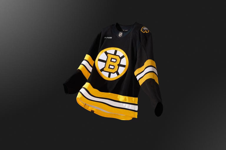
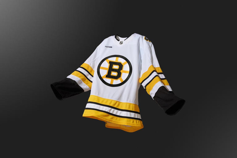
Striping returns to the 1980s pattern, which is cleaner and more proportional than the recent iterations. This is a team that understands its own graphic legacy — and this time, they’ve chosen to respect it instead of remixing it into mush.
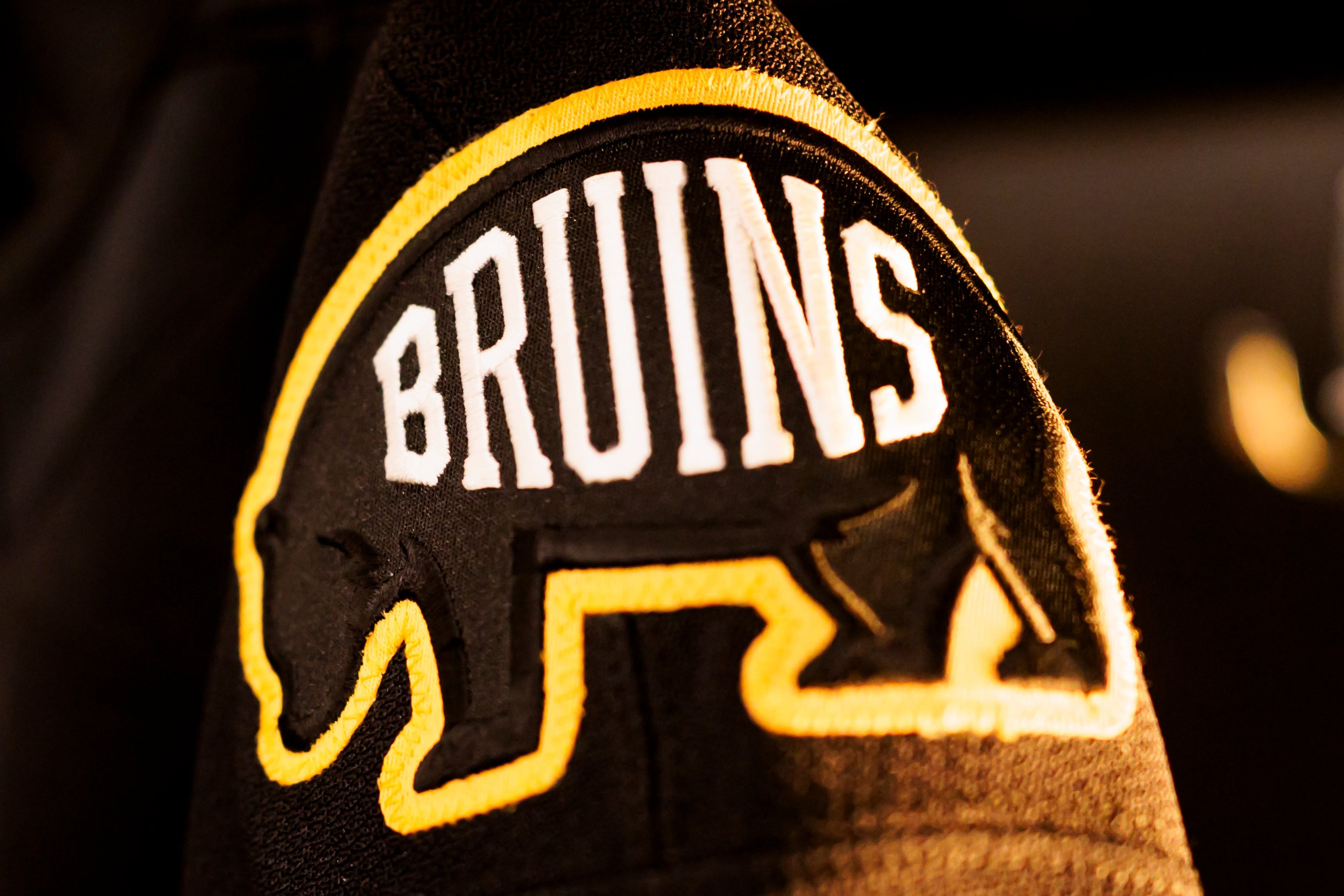
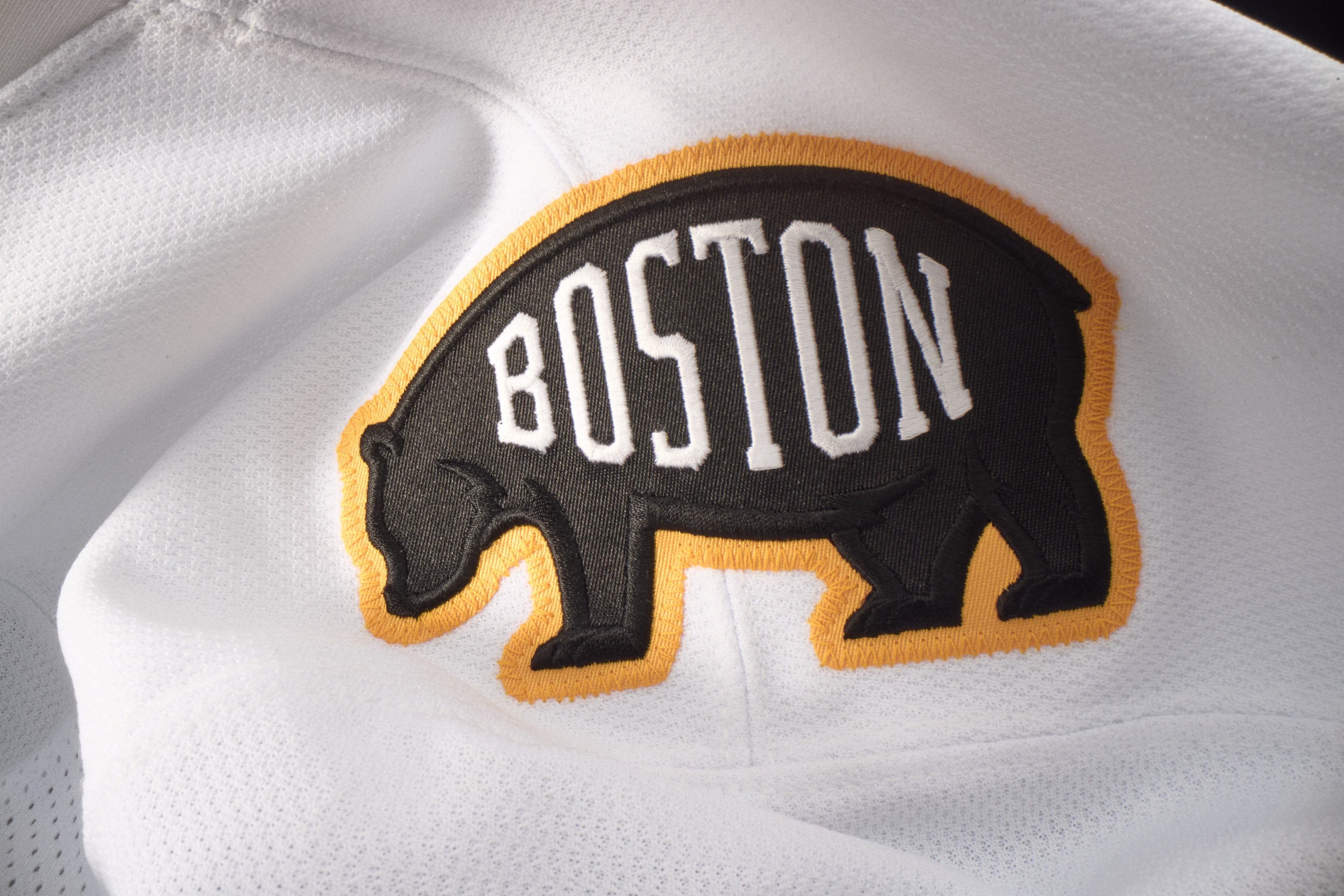
As for the shoulder patch: we get a new retro-feeling bear outline with arched text — a look that tries to split the difference between old-school and minimal. It’s... fine. I actually didn’t mind the “meth bear” emblem from previous sets — say what you will, it had personality. If we’re being honest, I’d have preferred a full return of the cartoon bruin head — one of the few stylized mascots that managed to look both vintage and tough. But alas, the era of serious hockey branding rarely leaves room for a little levity.
The Missing Sock
Here’s where things stumble: the black home uniforms are still paired with black socks — instead of the classic yellowsocks fans have been begging for. And it’s not a trivial miss.
Those yellow socks added contrast, balance, and a flash of gold that made the all-black set sing on TV. Without them, the look skews heavier, flatter, and a bit more generic. The all-black approach feels like it’s chasing some outdated “intimidation” logic — as if colour saturation correlates with aggression.
It doesn’t.
The Bruins, of all teams, have owned black for decades. They never needed to prove anything. The yellow socks weren’t weakness — they were confidence. They were the Bruins acknowledging their other team colour and embracing it proudly.

This redesign still earns a solid, well-deserved A — but skipping those golden socks? That’s the missed note keeping it from a full-throated A+.
Still, credit where it’s due: the Bruins have decluttered their brand, embraced their own visual history, and delivered a cleaner, sharper, smarter identity. Standing ovation from the design section.
Sometimes the boldest design move is knowing what to leave out. The Bruins’ redesign proves that refining your legacy doesn’t mean dulling your edge — it means sharpening your focus. At Orbit Studios, that’s exactly the kind of clarity and brand fluency we bring to the table.